Graphs API
The graphics you can use with mustachebox are designed to be easy to use and easy to customize.
When you create your backend, you can reuse the javascripts files mustachebox provides.
Each javascript files take a particular format of data to render your graph.
Google Chart
Those graph uses the google chart tools.
https://developers.google.com/chart/
Time series charts
Area, BarChart and ColumnChart all use the same format of data.
Data formating
The time series chart take a list of integer for each series:
[23, 45, 56, 67, 78]
you must also provide a list of label
['sales', 'expenses', 'counts', 'words counts', 'total']
Finaly, you must encapsulate your data in a dictionnary
{
 2004: ['2004', 7160, 546],
 2005: ['2005', 5654, 5435],
 2006: ['2006', 7656, 6545],
 2007: ['2007', 5435, 6545],
 'label': ['year', 'sales', 'expenses']
}
You can use a time_serie function to parse your data and use this function in your method. For exemple
def time_serie(**kwargs):
    """
    Render a time serie
    """
    resp = {2004: ['2004'],
            2005: ['2005'],
            2006: ['2006'],
            2007: ['2007']}

    for i in range(2):
        for k, v in resp.iteritems():
            v.append(int((random.random() * random.random()) * 10000))
        resp['label'] = ['year', 'sales', 'expenses']
    return resp
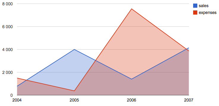
Area
Data formating
Complete Example
def render_area(self, **kwargs):
    self.template = 'area'
    return time_serie(**kwargs)
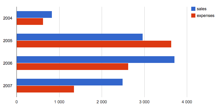
Bar Chart
Data formating
Complete Example
def render_barchart(self, **kwargs):
    self.template = 'barchart'
    return time_serie(**kwargs)
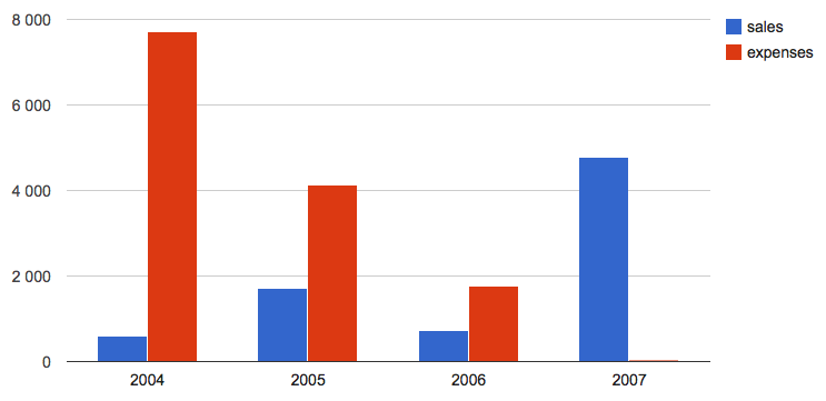
Column Chart
Data formating
Rendering
To render your chart you have to call the ‘columnchart’ template
self.template = "columnchart"
Complete Example
def render_columnchart(self, **kwargs):
    self.template = 'columnchart'
    return time_serie(**kwargs)
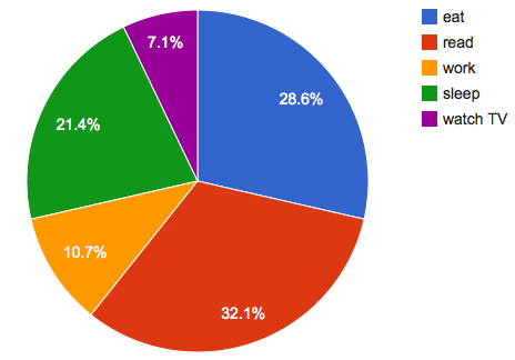
Pie Chart
Data formating
The data formating is a dictionnary containing :
- a list of label
- a list of dataset containing a string and an integer
The resulting dictionnary must look like this
{'label': ['name', 'count'],
 'records': [
                ['a name', 10],
                ...
            ]
}
The keys ‘label’ and ‘records’ are mandatory
Rendering
To render your chart you have to call the ‘pie_chart’ template
self.template = "pie_chart"
Complete Example
def pie_chart(self):
    self.template = "pie_chart"

    label = ['name', 'count']
    activities = []
    words = ['eat', 'read', 'work', 'sleep', 'watch TV']
    for elem in words:
        activities.append([elem, int(random.random() * 10)])

    return {'label': label, 'records': activities}
D3.js
Those graph uses the D3 js Toolkit.
Line Chart
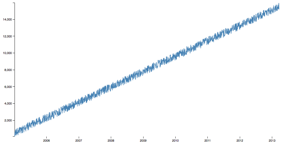
Data formating
The data must be a list of dict.
Each dict constain 2 keys :
- date : a timestamp multiplied by 1000 (python timestamps are in seconds and javascript timestamps are in milliseconds)
- value : an integer or a float
Rendering
To render your chart you have to call the ‘line_chart’ template
self.template = "line_chart"
Complete Example
def line_chart(self):

    response = []
    self.template = "line_chart"
    date = datetime.datetime(2005, 1, 1, 0, 0, 0)
    for i in range(1500):
        date += datetime.timedelta(days=2)
        response.append({
            'date': time.mktime(date.timetuple()) * 1000,
            'value': (i * 10) + int(random.random() * 1000)})
    return response